Brochure Printing: Do people still print brochures?

What’s that you ask? The power of brochure printing for businesses? Oh, get ready to be enlightened.
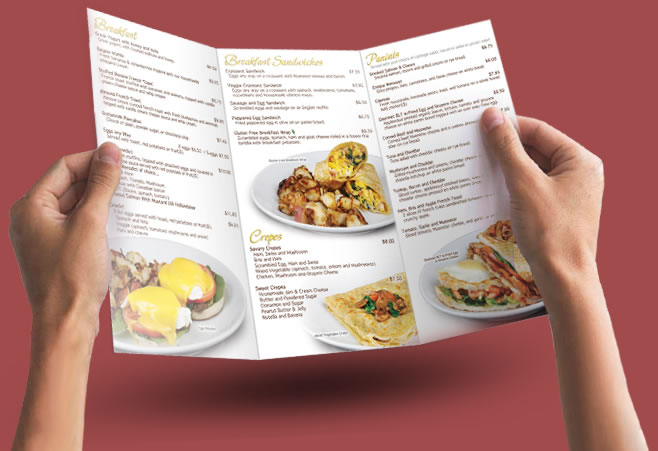
brochure printing

Have you ever been handed a brochure at a trade show and it’s so awful, you can’t help but laugh? Yes, we’ve all been there. But let’s face it, those brochures that make you laugh, they stick with you. You remember them. That’s the power of brochure printing!

But wait, there’s more. Among the myriad of marketing tools, the humble brochure is the unsung hero.

  1. Everlasting Impression: Unlike a fleeting online ad, a well-designed brochure is a physical object a customer can hold. It’s like a mini billboard that fits in their pocket. Can your Facebook post do that? I didn’t think so.
  2. Credibility on Paper: Ever handed someone a business card and they look at you like, “Okay, so what?” A brochure, on the other hand, is like a handshake and introduction all in one. It says, “Hello, we’re legitimate. And here’s why.”
  3. Your 24/7 Salesman: Even while you’re sleeping or binge-watching your favorite series, your brochure is out there, tirelessly selling your products or services. No need to feed it or give it breaks. It just… works.
  4. Easy to Distribute: Hand them out at trade shows, leave stacks in local businesses, or even do a direct mail campaign. It’s like a tiny, paper ambassador for your brand.
  5. Cost-effective: Compared to other forms of advertising, brochure printing is relatively cheap. So you can spend more money on important things like fancy office chairs or that espresso machine you’ve been eyeing.
brochure printing

So, the next time you’re thinking of ways to promote your business, don’t forget about the power of the humble brochure. It might just be the secret weapon you’ve been looking for. Now, isn’t that a funny thought? haha! Print brochures online with BlockbusterPrint.com

Brochure Printing for Furniture Shop Owners

When it comes to brochure printing, looking for a print shop and designing the material is easy. What is challenging is designing a brochure that the recipient will read and safekeep. For this, you need to know the elements of a good brochure design, which we will learn more about here. 

If you are a furniture shop owner, for example, how can you design a brochure that prospective customers will keep for future reference? Should they decide to redecorate their living room, they can check out the pieces featured on your brochure, and call your furniture shop for orders. To make sure that your brochure will be kept for future use, these design elements should be present: 

  • Purpose

Do you have a new furniture shop and you would like to introduce your business to homeowners and entrepreneurs? If yes, you must include a page that describes what your business is all about. There can be a brief description of your furniture business; what the design style is; and your mission and vision. 

  • Material

Brochures are made from 100# gloss text book paper or gloss cover paper. Partner with a reliable online printing services provider so that you can be made aware of your material options. 

  • Size and Folding Style 

The smallest brochure size available is 4.25” x 11” while the tabloid and map sizes are 11” x 17” and 11” x 25.5”, respectively. There are ten folding styles available, and the number of panels which you can turn into pages range from four to eight. 

  • Font and Graphics

People do not like reading through huge chunks of text, so lay out the content in such a way that there is a good mix of copy and graphics. If you will use photos or illustrations, make sure that they are high-resolution. Use easy-to-read font that suits your overall brochure design.

  • Call-to-action

Finally, there should be a call-to-action. Include your complete contact information at the back page, better if there is a promo code that entitles the holder of the brochure to discounts from your furniture shop.

Look for a reliable brochure print service provider then apply all these elements to your design. Once distributed, there should be an increase in the number of inquiries and orders for the items on your furniture shop, so start working on your marketing brochures now.

Brochure Printing & Marketing Tips to Live By

One of the biggest misconceptions that entrepreneurs have is that old school ways of advertising such as brochure printing is outdated and ineffective. Although digital marketing is cheap and in keeping with the times, it would definitely help if you can combine it with something “classic” like print advertising. In fact, it would make your brand stand out. Why? Since almost everything is digital these days, having something tangible – a brochure that customers can actually hold in their hands and read – is sort of a novelty. It etches the name of your brand into the minds of customers, and it complements your existing digital marketing campaign.

 Tips for Printing and Marketing Brochures for Your Business

 Now, if you have no idea about how to get started on brochure marketing, here are a few printing and marketing tips to live by:

  • Look for a reputable printing company that specializes in brochure printing.

There are many companies offering brochures print services out there, so choose one that’s right for you. Take your pick from digital desktop or offset printing – the latter produces more professional-looking results, although it can cost a bit more. Also make sure that the printing company has plenty of experience in printing advertising materials, and that they offer quality customer service. They should be able to assist you starting from the layout process to giving a digital proof of the design. This ensures that you will have an attention-grabbing brochure.

  • Talk about your brand, if you must, but focus more on your customers.

When thinking about the content of your brochure, determine what your goal is. If it’s to introduce your company to customers, then there’s nothing wrong in dedicating a page that indicates your company history, mission, vision, etc. But if your brochure is more marketing-oriented, you need to focus on how your product or service will benefit your customers. After all, they are the ones who will read your brochure – so the content should “speak” to them.

  • Organize the contents of your brochure.

Depending on the fold and size, the number of pages of a brochure ranges from 4 to 12. How will you organize the content in such a way that there’s a beginning, the main promotional pages, and an ending with a call to action? Make sure that the heading is enticing enough to prompt the customer to read through the rest of the content. Use words that are enticing but are still easy to understand. Focus on reaching your goal in printing the brochure in the first place.

  • Think of something that will make you stand out.

Lastly, think of an element that will make you stand out. It could be your folding option or the size of the brochure. How about an 11” x 25.5” brochure with double gate folding option, in a semi-gloss paper finish? The thicker the paper stock, the more impressive it will be. Again, you need to invest in high-quality offset brochure print service to come up with the exact type of brochure that you want – one that will help you achieve your marketing goals in no time at all.

How Brochure Printing Design has Evolved Over the Years

Similar to how television has evolved from black and white to colored and now, to smart TVs, brochure printing and other forms of printing advertisement have also evolved. Here, we will take a look at how this type of branding has evolved over the years, and how you need to print your own brochures now in order to promote your business.


A Quick Look at How Brochure Design has Evolved


As you may already know, a brochure looks like a mini-book or magazine. It contains information and pictures about the products or services you are offering. If you’re a business owner, you can definitely benefit from printing and distributing brochures with well thought-out designs and marketing copy.


So how did brochures look a long time ago? Here’s a brief glimpse:

  • In the 1940s, digital photography wasn’t born yet so there was heavy reliance on hand-drawn illustrations. If one or two photographs are included in a brochure, it’s black and white and the resolution is not that great. Also, colored printing was expensive during this decade so most printed materials are black and white.
  • In the 1950s, photography has greatly improved and the costs of colored printing went down, so brochures have become more colourful.
  • In the 1960s, it was pretty common to see colored brochures although old school hand-drawn illustrations and fonts were still used.
  • A decade later, brochures print has gone full-color because of the improvement in photography techniques. It has also become easier to layout printed materials and the costs of printing colored brochures have significantly gone down.


From the 1980s onwards, designing and printing brochures have become fully digital. Digital photography has evolved along with it, so it has become very easy to blend all these elements together. You just need to know how to come up with a strategic design that will appeal to your target market. You also need to include a call to action, as well as updated contact information for you to realize your marketing goals in the first place.


Today, when looking for a brochure print service provider, you even have the option to go with small desktop digital printing services or companies that use offset printing through huge printing presses. Offset printing presses deliver more professional-looking results, but there’s nothing wrong with going digital, either.


With the improvements in photography, printing, and layouting technology, there’s no doubt that brochure design has come a long way. Whether you prefer to use old school hand drawn illustrations or modern photography to make your brochure stand out, what’s important is to pay close attention to even the smallest details. Doing so will make you achieve your marketing objectives in printing the brochures in the first place.

Putting Together the Elements of Brochure Printing Design

When you receive a brochure at an event, do you ever wonder about the process that went behind brochure printing? If you are planning to have similar advertising products printed out, you definitely need to learn about the elements to have great-looking professional brochures. That’s what we will learn more about here.

Things to Consider when Having Brochures Printed Out

The first thing that you must look for is a good brochure print service provider. You can take your pick from either digital or offset printing services. There are dozens of digital printing services available but when it comes to brochures, you might want to go for offset printing. It might cost you a bit more but quality-wise, it’s far superior than digital.

After finding a suitable printing company, you have to come up with the design of the brochure itself. Here are some of the design elements to consider:

  • Folding type and assembly of pages

These are the brochure folding options usually available:

  • Accordion
  • Double parallel
  • Half then half
  • Half then trifold
  • Half fold
  • Single gate
  • Double gate
  • Roll fold
  • Trifold
  • Z-fold

If you want the half then trifold brochure, for example, there will be 12 pages available – back and forth. How will you assemble the pages in such a way that it’s easy to read? Can you effectively deliver the message with 12 pages, or would a 6-page trifold brochure be more suitable?

  • Type of paper and printing effect

To leave a lasting impression, choose thick stock paper. There are different sizes available ranging from 4.25” x 11” to 11” x 25.5”. For the printing effect, you can take your pick from semi-gloss or matte. Select one that will suit the design and paper type that you chose.

  • Copy and images

Brochures are made to deliver a message and your copy literally says a lot about that. If you want, you can hire a professional copywriter to write the content for you – especially if your brochure has a lot of pages. For the image, it has to be professionally shot, compelling, and eye-catching.

  • Other factors to consider

Also consider readability. The design, colors, and font of the brochure must match the image that you’d like to create for your company or brand.

By taking these design elements into consideration, you can create the perfect brochure to use for your print marketing campaign.


Brochure Printing Tips to Make Your Ad Really Stand Out!

Brochure printing serves as an effective and budget-friendly way of getting your message across. Whether you’re offering a product or service to your customers, you can distribute brochures and use it as a way to promote your brand. If you’ve been in the business for a long time and you’re looking for something to entice new customers, brochures are a great way to introduce them to your target audience.

Tips to Remember when Printing Brochures

To effectively deliver your marketing message, you need to learn about the process behind creating professional brochures. What exactly is involved in the process and how can you make sure that you are creating an effective marketing material? Here are a few brochure printing tips to remember:

  • What’s your goal for creating the brochure in the first place?

Before thinking about colors, layout, font, and all the other design elements, answer this question first: What is your goal for creating the brochure? Are you a start-up company and you’d like people to know that your business actually exists? Are you promoting a new product or service? Are you rebranding in order to attract an older or younger age group than your usual customers? Would you like the reader to visit your office, your website, or take advantage of an offer? After pinpointing your goal, you can come up with a brochure design to fit such purpose.

  • Design the brochure in such a way that it reflects your brand’s image.

When using promotional materials, you need to deliver a consistent message. This should reflect on your business cards, letterheads, notepads, and all the other printed products that you will use.

  • Create that delicate balance between having great images and excellent copy.

Do not scrimp and use stock photos online if you want to have a well-balanced brochure. Invest in the services of a professional photographer to have a well-lit, eye-catching image. At the same time, you should make sure that the copy is grammatically correct, catchy, effective, and has a call to action to make the message effective.

Finally, invest in good quality printed products like brochures. There are digital and offset printing companies out there – the latter offers better print quality. Pay attention to the material used and the folding options.

By keeping these things in mind, you can effectively create brochures that will complete your print marketing campaign.